Chess.com: A Case Study in Bad Design

I've taken to playing a lot of chess, recently. I'm not good, but I know good design when I see it. Or, in this case, hear it. A lot.
Sometimes, bad design arises from one single bad decision. Sometimes, bad design arises from several small, thoughtless decisions interacting with one another. This is a case of the latter.
The Problem
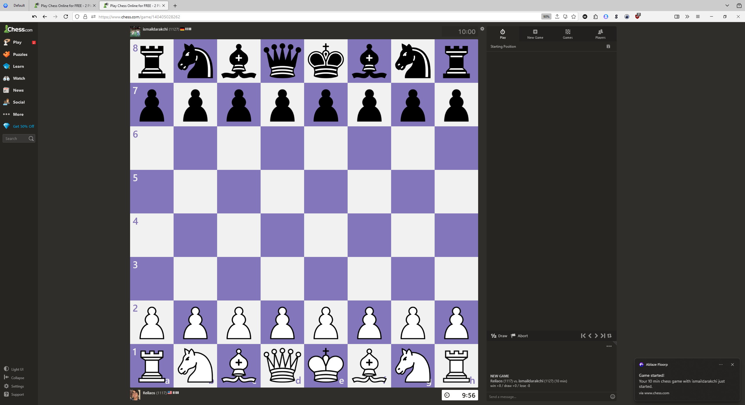
First you play a game! It's a normal game. It makes sounds whenever you move a piece, or get checked.
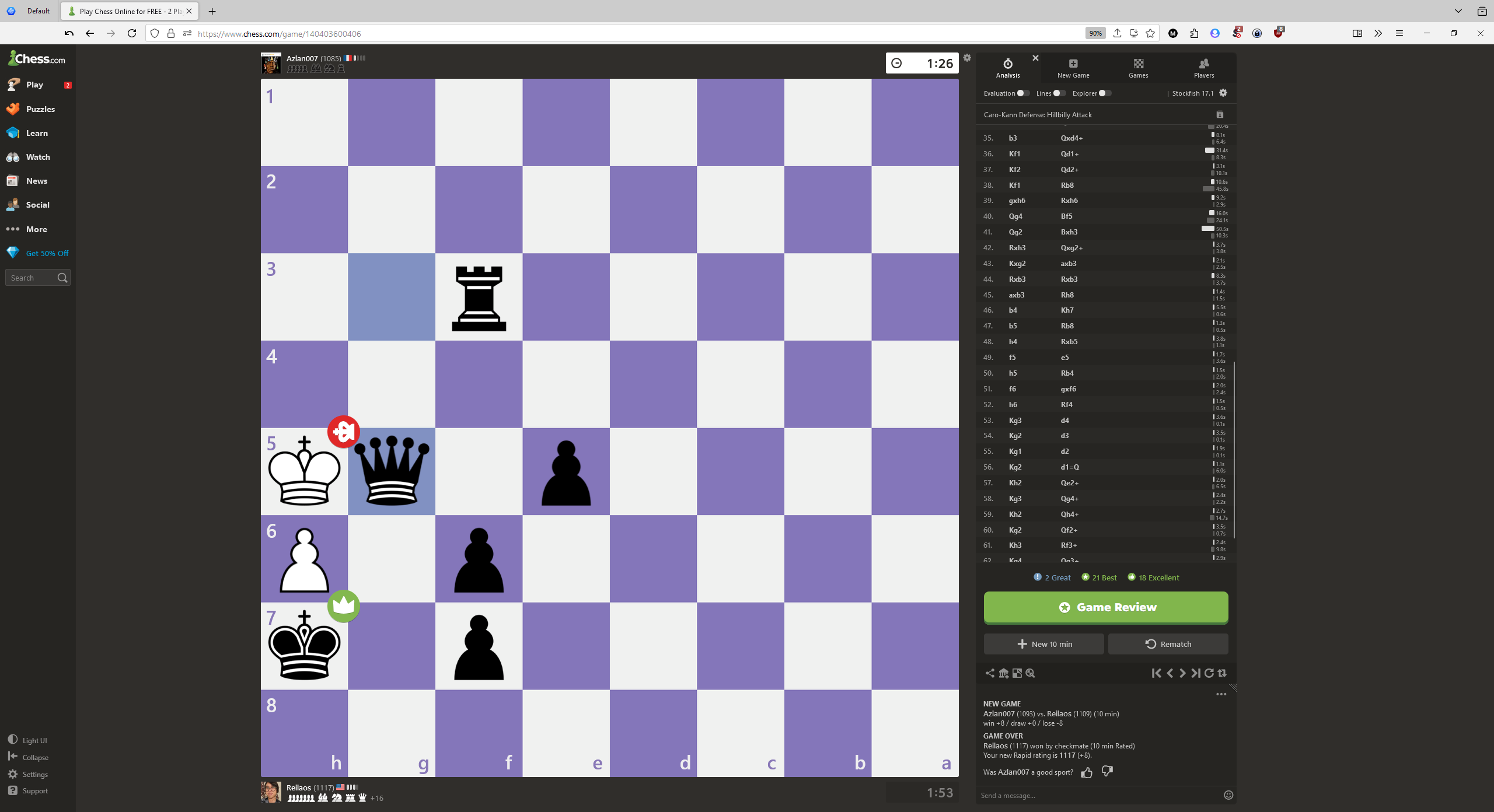
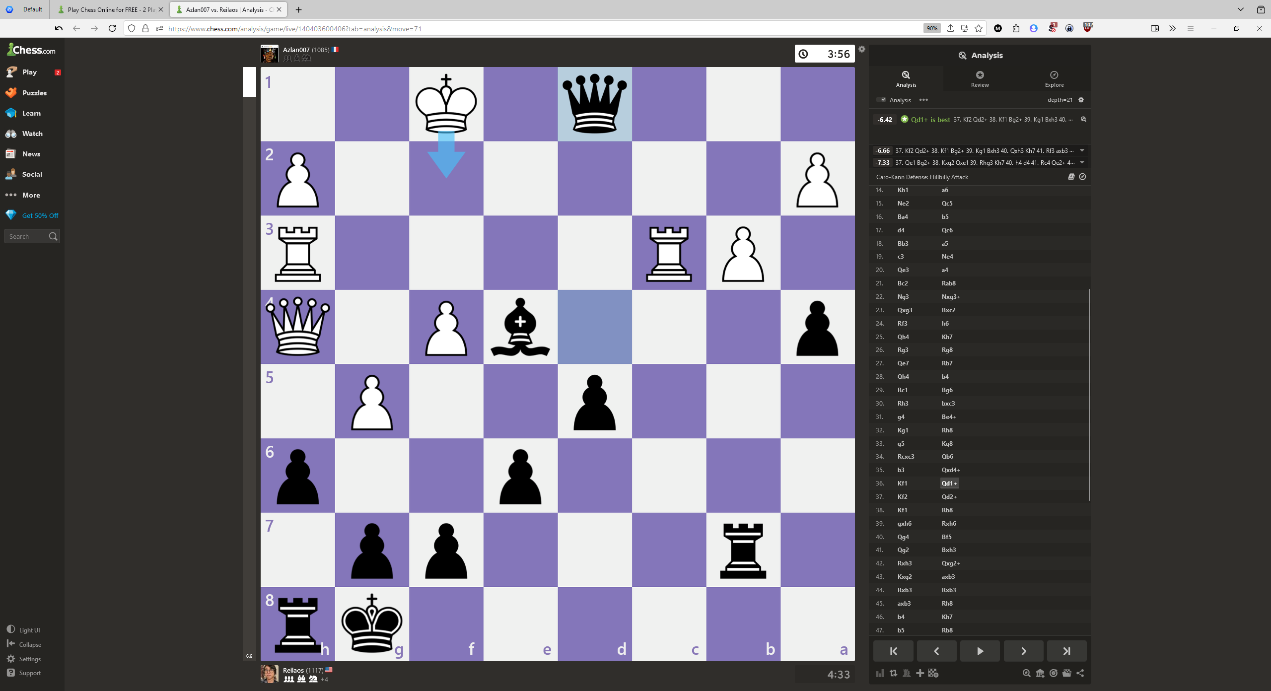
Congrats, you won! Now, like a someone who properly wants to improve, you go into the review, or the self-review. This opens up in a new tab. That's fine. Not a big deal.
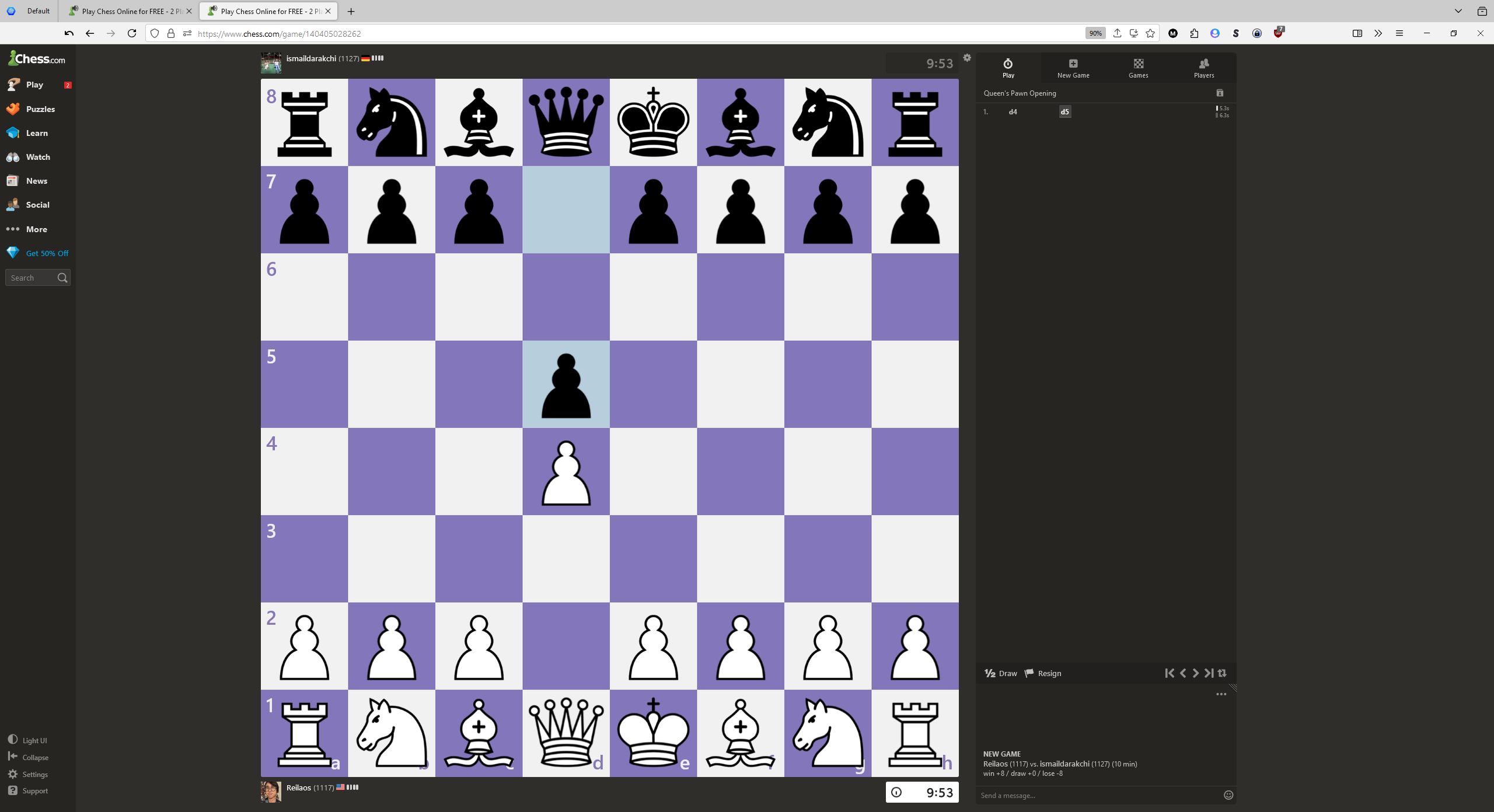
Okay, now you've finished your review. It's time for a new game!
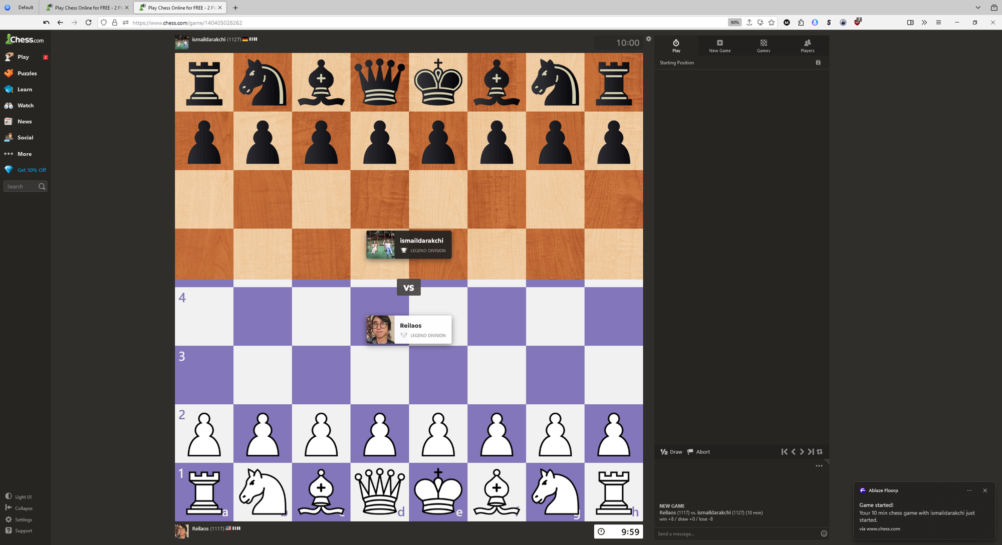
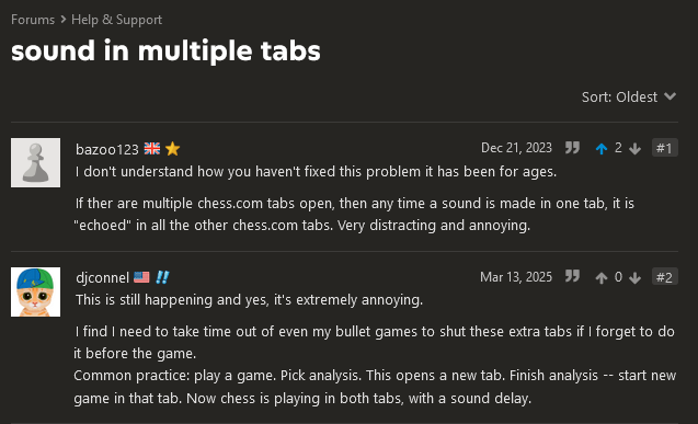
Surprise! This new game is somehow playing sounds in both tabs you have. Look in the icons on the tabs. They both have the "making noise" icon. Chess.com has decided that if you play a game in one tab, you want to play it on all your tabs for some reason.
Every move will make multiple sounds, one for each open tab.
Now you have to burn time in your game to close it. God forbid you have other tabs open. You might need to abort the game so you can deal with things before starting the next. Or maybe you deal with an infuriating sound for the whole game.
It's infuriating and it wastes time. It wouldn't be that bad if Chess.com's own encouraged user flow didn't open up more tabs for you. At least then it would only happen if you opened your own new tab to Chess.com.
But wait! It gets worse!
If you have an 'active' tab open on your desktop, it'll stop playing sounds if you pick up your phone! Madness. You leave your computer, lie down in your bed and try to pick up a game, and your PC just starts playing the sounds, too! Who thought this was a good idea?
Why?
All of these little issues build into one big annoying one, and none of them seem to be useful in any way. They actively make one of Chess.com's paid features, Game Review, worse and more inconvenient for those with a subscription, as this issue applies to Game Review and not just self-analysis like shown.
It isn't even a new problem
This has been going on for years! Who approved of any of these UI features?
Is Lichess better?
Chess.com's problem is, ultimately, multiple baffling decisions that wouldn't individually be that big a deal. Is Lichess, their big competitor, any better?
Yes. In every regard. Opening the analysis board doesn't create a new tab. Starting a game doesn't play that game in all tabs. Neither does playing on my phone. And I didn't have to pay for the privilege of being inconvenienced in any of these ways by the analysis.
Use Lichess. It doesn't spam you to pay for bad features. No ads. Just chess.